Quick Look:
Separate but unequal: Charts show growing rich-poor gap – Yahoo! News.
by Zachary Roth
This a quick follow-up to my February 18th, 2011, post wherein I comment on a news article entitled, How the Middle Class Became the Underclass. The growing income gap is a topic that we have been tracking for some time now. The growing income gap is a central theme of Daniel Brook’s 2008 book The Trap: Selling Out to Stay Afloat in Winner-Take-All America. Brook talked about the growing income gap at our first RYOL Lecture. (For more on the Foundation’s RYOL Lecture Series, use the link above). Brook talked about how the growing income gap could lead to increasing “brain drain” in the non-profit sector, increased housing insecurity, increased job insecurity, a decrease in funding to schools, and an increase in the inability to pay for college. In short, the increasing income gap plays a role in many of the social ills facing foundations today. For more on Brook’s work and lecture, see my posts of July 29th and 30th, 2010. Here are a few charts from Roth’s article graphically illustrating the growing income gap. The text accompanying the charts was written by Roth. Enjoy (if you can keep your gorge from rising).
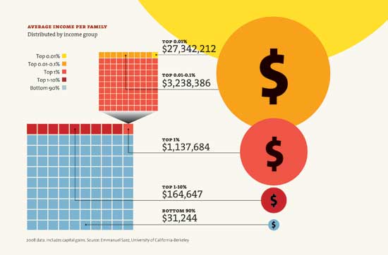
This chart shows that the poorest 90 percent of Americans make an average of $31,244 a year, while the top 1 percent make over $1.1 million:
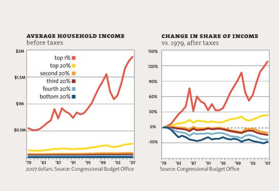
According to this chart, most income groups have barely grown richer since 1979. But the top 1 percent has seen its income nearly quadruple:
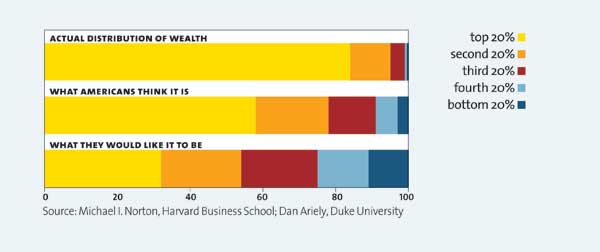
And this chart suggests most Americans have little idea of just how unequal income distribution is. And that they’d like things to be divvied up a lot more equitably:


